Theme Components
This is a quick showcase of some of the main custom components that come with this theme.
Accordion
Block components used to create an Accordion using Bootstrap' collapse plugin.
The bedding was hardly able to cover it and seemed ready to slide off any moment. His many legs, pitifully thin compared with the size of the rest of him, waved about helplessly as he looked. "What's happened to me?" he thought. It wasn't a dream.
The bedding was hardly able to cover it and seemed ready to slide off any moment. His many legs, pitifully thin compared with the size of the rest of him, waved about helplessly as he looked. "What's happened to me?" he thought. It wasn't a dream.
The bedding was hardly able to cover it and seemed ready to slide off any moment. His many legs, pitifully thin compared with the size of the rest of him, waved about helplessly as he looked. "What's happened to me?" he thought. It wasn't a dream.
import { Collapse } from 'reactstrap
const Component = () => {
const [collapse, setCollapse] = React.useState({1: true})
const toggleCollapse = (e,tab) => {
e.preventDefault()
setCollapse({...collapse,[tab]: !collapse[tab]})
}
return (
<div role="tablist">
<div>
<a href="#" className="block-toggler my-3" aria-expanded={collapse[1]} onClick={(e) => toggleCollapse(e, 1)}>Option 1<span className="block-toggler-icon"></span></a>
<Collapse isOpen={collapse[1]}>
<div className="p-3">
<p className="text-muted mb-0">The bedding was hardly able to cover it and seemed ready to slide off any moment. His many legs, pitifully thin compared with the size of the rest of him, waved about helplessly as he looked. "What's happened to me?" he thought. It wasn't a dream.</p>
</div>
</Collapse>
</div>
<div>
<a href="#" className="block-toggler my-3" aria-expanded={collapse[2]} onClick={(e) => toggleCollapse(e, 2)}>Option 2<span className="block-toggler-icon"></span></a>
<Collapse isOpen={collapse[2]}>
<div className="p-3">
<p className="text-muted mb-0">The bedding was hardly able to cover it and seemed ready to slide off any moment. His many legs, pitifully thin compared with the size of the rest of him, waved about helplessly as he looked. "What's happened to me?" he thought. It wasn't a dream.</p>
</div>
</Collapse>
</div>
</div>
)
}
export default Component
Animations
The theme uses a great plugin for on-scroll animations, AOS.
To activate the animations on particular element, just choose from the available animations and paste it into element's data-aos attribute, e.g. data-aos="flip-up" or data-aos="zoom-in".
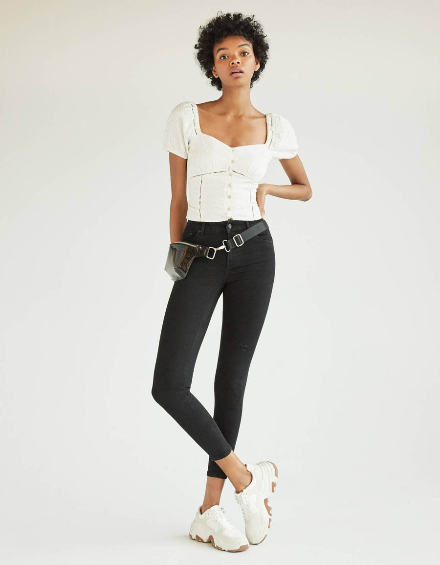
Zoom-in animation.

Flip-up animation.
Blob
In the design variants of the homepage, I use colourful SVG blobs. At the moment, I have included four types into a SVG sprite, if you would need more, just get in touch. The usage is simple - to insert a basic blob, use syntax <Icon className="svg-blob" icon="blob-shape-4">
If you'd add className="svg-blob-fill-current" to the Icon component, it will inherit also a fill colour from its parent.
Cart
Cart is dynamic and uses combination of React context API and Local Storage API. Thanks to that, users cart items are stored even after he leaves the store. Cart is also immediately updated after adding or removing items from it.
Remove automatic demo data adding to cart - please follow comments in code of Header component (useEffect part) to remove adding of demo data
CartItems component - A responsive cart component used in cart overview or final order review. On smaller displays, a horizontal srollbar appears.
Add item to cart - see CardProduct component
import { addCartItem } from '../hooks/UseCart'
import { CartContext } from '../components/CartContext'

export default ({ item }) => {

    const [cartItems, dispatch] = React.useContext(CartContext)

    const addToCart = (e,product) => {
        e.preventDefault()
        addCartItem(product, "1")
        dispatch({type: 'add', payload: product, quantity: "1"})
    }

    return (
        <a href="#" onClick={(e) => addToCart(e,item)}>
            Add item
        </a>
    )
}
Remove item from cart - see CartItems component
import { removeCartItem } from '../hooks/UseCart'
import { CartContext } from '../components/CartContext'

const Component = ({ item }) => {

    const [cartItems, dispatch] = React.useContext(CartContext)

    const removeFromCart = (e,product) => {
        e.preventDefault()
        dispatch({type: 'remove', payload: product})
       removeCartItem(product)
    }

    return (
        <a href="#" onClick={(e) => removeFromCart(e,item)}>
            Add item
        </a>
    )
}

export default Component
Change quantity of cart item - see CartItems component
import { removeCartItem } from '../hooks/UseCart'
import { CartContext } from '../components/CartContext'

const Component = ({ item }) => {

    const [cartItems, dispatch] = React.useContext(CartContext)

    const decreaseQuantity = (product) => {
        if(product.quantity > 1) {
            addCartItem(product, product.quantity - 1)
            dispatch({type: 'add', payload: product, quantity: product.quantity})
        }

    }

    const increaseQuantity = (product) => {
        addCartItem(product, product.quantity + 1)
        dispatch({type: 'add', payload: product, quantity: product.quantity})
    }

    return (
        <>
        <button onClick={() => decreaseQuantity(item)}>-</button>
        <button onClick={() => increaseQuantity(item)}>+</button>
        </>
    )
}

export default Component
Cards
This theme comes with two card styles.
CardProduct component - supported props
- product - product object
- masonry - if true, masonry image will be selected from product object
import { Col, Row } from 'reactstrap'
import CardProduct from '/CardProduct'
import products from '/products.json'

const Component = () => {
    return (
        <Row>
            {products.map((product, index) =>
                <Col key={index} sm="4" xl="3" xs="6">
                    <CardProduct product={product} />
                </Col>
            )}
        </Row>
    )
}

export default Component
CardPost component - supported props
- post - post object
- category - if true, category style view enabled
import { Col, Row } from 'reactstrap'
import CardPost from '/CardPost'
import posts from '/posts.json'

const Component = () => {
    return (
        <Row className="mt-4">
            {posts.map((post, index) =>
                <CardPost key={index} post={post} category />
            )}
        </Row>
    )
}

export default Component
Category Top Bar
A simple component with items per page, items filter, ordering and no. of displayed items information. Displayed above the product grid.
Component supports filter prop, which enables products filter dropdown.
import CategoryTopBar from '/CategoryTopBar'

const Component = () => {
    return (
        <CategoryTopBar />
    )
}

export default Component
Filters
Filters component allows you to show filters either above products or in sidebar in product category.
Brand
Size
Price
Colour
Tags
Icons
This theme comes with two icon packs and includes icon component for simple icon management.
Icon component - supports two props.
- icon prop defines which icon you want to use.
- className prop defines classes.
import Icon from '/Icon'

const Component = () => {
    return (
        <Icon icon="checkout-cart-1" className="w-3rem h-3rem mb-5 svg-icon-light text-dark" />
    )
}

export default Component
70+ Premium E-commerce SVG icons
For a complete icon reference, see here.
Vector icons and social logos on your website with Font Awesome, the web’s most popular icon set and toolkit.
These icons are mostly used in buttons or for social network links. For a complete icon reference, see here.
Product Modal
A component based on a Bootstrap modal with a product images carousel
import ModalQuickView from '../../ModalQuickView'

const Component = () => {
    const [quickView, setQuickView] = React.useState(false)
    return (
        <div>
            <button onClick={() => setQuickView(!quickView)}>Toggle product modal</button>
            <ModalQuickView isOpen={quickView} toggle={() => setQuickView()} product={product}/>
        </div>
    )
}

export default Component
RESPONSIVE COLLAPSE
Responsive collapse blocks with a toggler link. Used in the sidebar for collapsing the inactive menu blocks on smaller displays. Add .expand-lg to a .collapse block and it will expand on lg+ displays. This component is used on the sidebar blocks in the product categories.
React ID Swiper
Touch enabled React plugin that lets you create a beautiful responsive carousel sliders.
Used for the homepage carousel and for the brands carousels. You can use Swiper templates included in this template or import and customize on your own using docs for this plugin.
Brands Swiper
import ReactIdSwiper from 'react-id-swiper'
import brandsLogos from '/brands-logos.json'

const Component = () => {

    const params = {
        containerClass: 'swiper-container brands-slider pb-5',
        slidesPerView: 4,
        spaceBetween: 15,
        loop: true,
        roundLengths: true,
        pagination: {
            el: '.swiper-pagination',
            clickable: true,
            dynamicBullets: true
        },
        breakpoints: {
            1200: {
                slidesPerView: 5
            }
        }
    }

    return (
        <ReactIdSwiper {...params}>
            {brandsLogos.map((brand, index) =>
                <div key={index} className="h-auto d-flex align-items-center justify-content-center">
                    <img
                        src={brand.img}
                        alt={brand.title}
                        className="img-fluid w-6rem opacity-7"
                    />
                </div>
            )}
        </ReactIdSwiper>
    )
}

export default Component
React Maginifier
React plugin to enlarge images on touch, click, or mouseover. For a complete reference, see React Magnifier's docs.
import Magnifier from "react-magnifier"

const Component = () => {
    return (
        <Magnifier
            mgShowOverflow={false}
            mgWidth={2000}
            mgHeight={2000}
            className="img-fluid"
            src="/image/src"
            alt="image
            description"
            zoomFactor={.11}
            style={{ cursor: 'pointer' }}
        />
    )
}

export default Component
React Select
Varkala Theme uses React Select plugin for showing select input. You can customize it using props.
SERVICES BLOCK
Easily format main advantages or services in the services block. Columns in this block have a border on the right which disappears on smaller display sizes.
Free shipping & return
Free Shipping over $300
Money back guarantee
30 Days Money Back Guarantee
Best prices
Always the best prices
020-800-456-747
24/7 Available Support
Wishlist
Wishlist is dynamic and uses combination of React context API and Local Storage API. Thanks to that, users wishlist items are stored even after he leaves the store. Wishlist is also immediately updated after adding or removing items from it.
Remove automatic demo data adding to wishlist - please follow comments in code of Header component (useEffect part) to remove adding of demo data
WishlistItems component - A responsive wishlist component used in wishlist overview. On smaller displays, a horizontal srollbar appears.
Add item to wishlist - see CardProduct component
import { addWishlistItem } from '../hooks/UseWishlist'
import { WishlistContext } from './WishlistContext'

const Component = ({ item }) => {

    const [wishlistItems, wishlistDispatch] = React.useContext(WishlistContext)

    const addToWishlist = (e,product) => {
        e.preventDefault()
        addWishlistItem(product)
        wishlistDispatch({type: 'add', payload: product})
    }

    return (
        <a href="#" onClick={(e) => addToWishlist(e,product)}>
            Add item
        </a>
    )
}

export default Component
Remove item from wishlist - see WishlistItems component
import { removeWishlistItem } from '../hooks/UseWishlist'
import { WishlistContext } from './WishlistContext'

const Component = ({ item }) => {

    const [wishlistItems, wishlistDispatch] = React.useContext(WishlistContext)

    const removeFromWishlist = (e, product) => {
        e.preventDefault()
        dispatch({ type: 'remove', payload: product })
        removeWishlistItem(product)
    }

    return (
        <a href="#" onClick={(e) => removeFromWishlist(e,product)}>
            Add item
        </a>
    )
}

export default Component
Top Bar
Top bar element that precedes the navbar, as seen also on this page. Great to display telephone number, language or currency choice or similar.
Background image
Utility class that turns a <img className="bg-image"> into a background image for its background. Useful e.g. for carousels. Make sure that image's parent container and the content that should be placed over the image are relatively positioned.

I have a background image
Image overlay
Utility class that darkens or lightens the backround image of the element to enhance the legibility. It can be used with cards, carousel slides, etc. Now with responsive behaviour too.
Class reference
.dark-overlay or .light-overlay - CSS class to be used on the element, accepts Boostrap responsive suffixes. (e.g. .dark-overlay.dark-overlay-lg-0 creates overlay on smaller viewports and hides it on lg+ screens.)
.overlay-content - use this class on the element's content to increase its Z-index and move it above the overlay layer
Responsive borders
Responsive borders as an addition to Bootstrap's border utilities.
Class reference
.border-sm, .border-md, etc.
Block utilities
Additional utility classes, for block elements mostly.
Class reference
.bg-gray-100 to .bg-gray-900 - grayscale backgrounds
.bg-primary-light, .bg-secondary-light - lighter backgrounds for the theme colours
.opacity-1 to .opacity-9 - opacity helper
.hover-scale - scale element on hover
.hover-animate - move element up by few pixels on hover
.hover-scale-bg-image - scale element's background picture on hover
Text utilities
Additional utility classes, for block elements mostly.
Class reference
.text-gray-100 to .text-gray-900 - grayscale text colours
.text-sm, .text-lg, .text-xl - text sizes
.letter-spacing-1 to .letter-spacing-5 - letter spacing 0.1em to 0.5em
.z-index-1 to .z-index-5 - z-index from 10 to 50
.text-hover-primary, etc. - text colour on hover/focus for theme colours
.overflow-visible and .overflow-hidden - overflow control
